 IGUANIFY
Series Poster Design in Half a Day: Six Steps for Episodic Creators
A series poster has one job at the size that actually matters: it has to sell tone and hook a scroller inside a 2:3 thumbnail before they read a single word. That means your first move isn’t a “poster,” it’s a thumbnail-first portrait poster kit built from one layered master file, with a face-forward hero image at the center. A tool like Iguanify can generate that consistent, character-driven kit alongside your episodes.
TL;DR:
- Creating a consistent poster kit from a high-resolution master image ensures color, character framing, and branding stay uniform across all platform assets.
- Face-driven key art outperforms title-only images because expressive faces quickly communicate emotion and viewer interest, especially for new or indie series.
- Test thumbnail legibility at 92x138 pixels before finalizing to ensure key visuals are instantly recognizable and not dependent on fine details.
- Using repeatable export presets and tools like Iguanify streamlines production, maintaining character and color consistency across episodes without extra design effort.
- Incorporating clear copyright, licensing, and accessibility considerations in image and font choices prevents legal issues and improves poster legibility for all viewers.
Table of Contents
- What Assets Belong in a Series Poster Design Kit?
- Why Do Faces Outperform Titles in Key Art?
- How Do You Build a Series Poster Kit in Six Steps?
- What Are the Right File Specs for Poster Exports?
- Do You Own the Images and Fonts in Your Poster?
- How Should Season Numbering and Branding Work Across Episodes?
- Is Your Poster Text Actually Readable?
- How Do You Add Accolades Without Cluttering the Poster?
- What Tools Handle Series Poster Production at Scale?
- Distribute the Kit, Then Test What Actually Works
- Why a Repeatable Poster Kit Beats a One-Off Design
- Get Your Poster Kit Built Alongside Your Episodes
- Sources
What Assets Belong in a Series Poster Design Kit?
A series poster is not one file. It’s a family of derivatives pulled from a single master image, sized and cropped for wherever a viewer might first see your show. Skipping this and designing each size separately is how shows end up with mismatched color, inconsistent character framing, and a “who made this” feel across platforms.
Build the master at high resolution, with your hero character or characters composed off-center so you have room to crop. Then derive everything else from it:
- Portrait poster (2:3): the anchor asset, used for streaming guides, print, and press kits.
- Thumbnail crop (1:1 or 16:9, small-scale test): the same hero image cropped tight on the face, tested at actual thumbnail pixel dimensions, not just scaled down on your monitor.
- Social squares (1:1): for feed posts and profile art, usually a simplified version of the portrait with less negative space.
- Cover banner (16:9): for platform hero sections and YouTube channel art.
- Episodic stills: one distinct image per episode so week-to-week posts don’t all look identical. The BBC’s photography guidance treats portraits and episodic images as separate categories for exactly this reason.
- Title lockup: your logo and season number as a standalone transparent file, layered on top rather than baked in.
Use the portrait for anything a viewer studies. Use the thumbnail crop for anything they scroll past in under a second. That distinction drives almost every design decision that follows.
Why Do Faces Outperform Titles in Key Art?
Netflix’s own A/B testing found that key art showing expressive faces and recognizable characters drove meaningfully higher engagement than art centered on logos, objects, or wide establishing shots. A face reads emotion in a fraction of a second. A title card requires the viewer to stop and read, and most won’t.
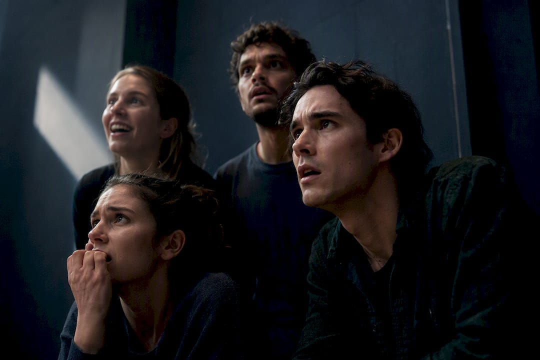
For a new or indie series with no existing audience, that gap widens. Stareable’s guidance on key art is blunt about it: title-only images perform poorly for emerging shows because there’s no brand recognition yet doing the work for you. A face does that work instead.
Three rules follow from this:
- Make a character’s expression the primary visual hook, not the title.
- Keep the title secondary, and if it appears at thumbnail size, make it large enough to be legible without zooming in.
- Choose a moderate color saturation rather than maxing it out. Netflix’s capstone research on successful key art reported moderate color saturation, comfortably below the extreme end of the scale.
Composition matters as much as color. Design a single hook, not three competing ones, crop it for a thumbnail first, and leave a safe margin around the edges so platform overlays (play buttons, progress bars, rating badges) never clip your character’s face or your title lockup.
Pro Tip: Screenshot your poster at 92x138 pixels, roughly what it renders at in a crowded thumbnail row, before you finalize anything. If the face and title aren’t instantly readable there, no amount of detail work at full resolution will fix it.
How Do You Build a Series Poster Kit in Six Steps?
You don’t need a design team to run this pipeline. You need about half a day per season, and a repeatable process that doesn’t reinvent itself every time you drop a new episode.
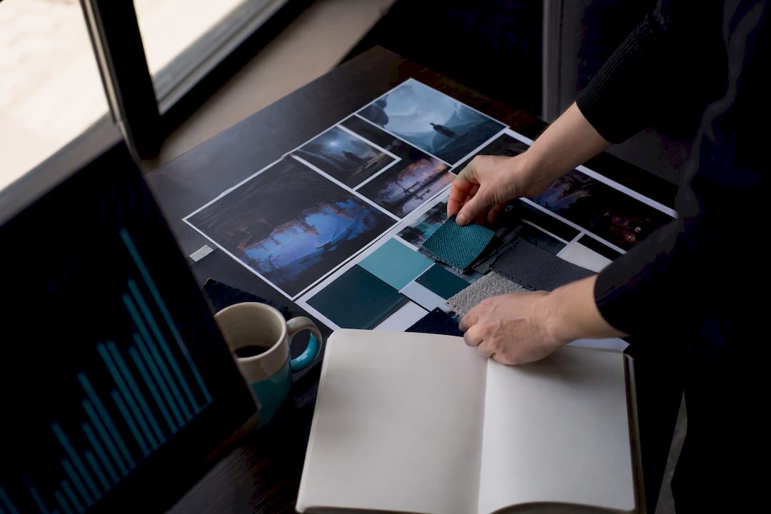
- Define the visual DNA. Spend 10 to 15 minutes building a moodboard: pull 8 to 10 reference images that match your show’s tone, then extract a 3 to 4 color palette from them. This becomes your show’s color tag, the thing that makes episode 12 instantly recognizable as the same series as episode 1.
- Select your hero frame. For character-driven drama, that’s an expressive face. For action or thriller series, a mid-action still often works better than a static portrait. Pick based on genre, not personal preference.
- Compose thumbnail-first. Crop and test at actual thumbnail dimensions before you touch the full poster layout. If the composition doesn’t survive the small size, redo it now rather than after you’ve built five derivative files.
- Build the master layered file, then the title lockup. Keep character art, background, and text on separate layers. Export the title and season number separately as a transparent PNG so you can swap it across seasons without touching the artwork.
- Export named variant presets. Set up presets once (poster, thumbnail, square, banner) with safe-zone guides baked in, so every future export takes minutes, not a redo from scratch.
- Run a quick A/B test, then iterate. Try two thumbnail crops or two color treatments across your first few episodes, watch which one holds attention longer, and carry the winner forward into the next batch.
This mirrors the process HBO Max’s key art teams use for their own shows: thumbnail-first composition paired with a character-driven hierarchy, scaled through a defined aspect-ratio system rather than redesigned from scratch for every size.
What Are the Right File Specs for Poster Exports?
Get your export specs wrong and you’ll be reworking files the week before launch. Set these up once as presets and reuse them for every episode and season.
- Poster art: 2:3 ratio, 2000×3000 pixels, matching the size streaming platforms commonly request.
- Cover/banner art: 16:9 ratio, 3840×2160 pixels for hero placements and channel art.
- Social squares: 1:1, minimum 1080×1080 pixels for feed posts.
- Thumbnail test crop: export small (roughly 92x138 or your platform’s stated thumbnail size) purely to check legibility, not for actual delivery.
- Title lockup: PNG with a transparent background, never flattened into the base artwork, so it can be swapped or scaled independently.
- File format: PNG for anything with transparency or text, JPEG for flattened deliverables where file size matters, WebP for web-only social assets where smaller size helps load speed.
Amazon’s artwork specification guide is a useful baseline model even if you’re not distributing through Prime. It defines poster and cover dimensions precisely and warns against small text and low-contrast titles, because reviewers reject files that fail legibility checks before they ever go live. Keep a safe margin of roughly 5 to 10% inset from every edge so nothing critical sits where a platform overlay might crop it, and check your maximum file size against whatever ad network or streaming portal you’re uploading to before final export.
Do You Own the Images and Fonts in Your Poster?
Copyright clearance is the part creators skip until a platform flags their upload or a font foundry sends a licensing notice. Handle it up front, not after your poster is live.
Every image in your master file needs a clear usage right. That means art you generated yourself, stock photography licensed for commercial use, or original photography you commissioned. Stock sites vary wildly in what their licenses actually permit. A “standard license” image is often fine for a thumbnail or social post but restricted from paid advertising or merchandise. Read the specific license terms attached to each file, not just the platform’s general policy page.
Fonts carry the same risk and get overlooked more often. Most free font downloads are licensed for personal use only. Commercial use, especially on a poster you’re using to promote a show you monetize, typically requires a separate commercial or web license from the foundry. Check the license file that ships with the font, or the foundry’s own licensing page, before locking your title lockup into a typeface you haven’t cleared.
If your series uses real people’s likenesses, whether AI-generated cast members styled to resemble a real person or photography of actual actors, get clear consent or release documentation before publishing. This matters more, not less, as AI-generated cast art becomes common in episodic production. When in doubt on a specific use case, a quick consult with a media attorney costs far less than a takedown notice after your launch.
How Should Season Numbering and Branding Work Across Episodes?
Consistency is what turns a stack of posters into a recognizable series. The goal is a visual system your audience learns to spot, not a fresh design decision every time you publish.
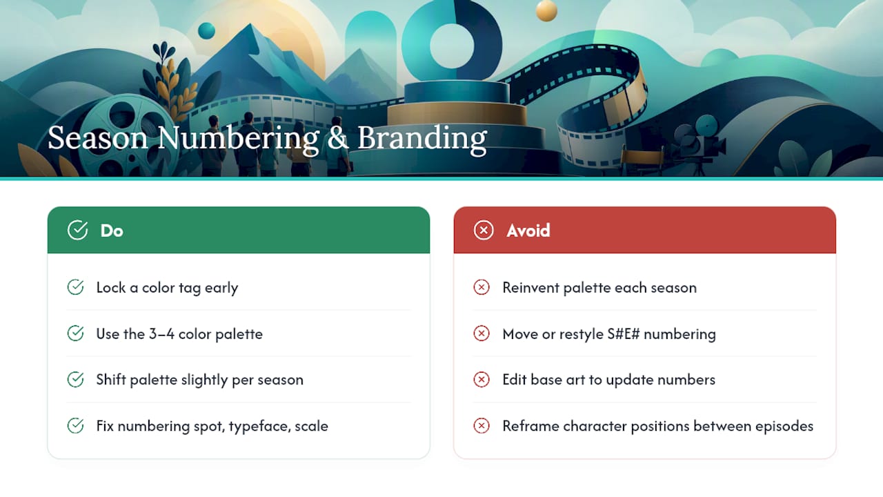
Lock a color tag for your show early, the 3 to 4 palette you pulled during the moodboard step, and carry it across every episode and season. When you launch season 2, shift the palette slightly (a different accent tone, a darker background) rather than reinventing it, so returning viewers register “same show, new chapter” instantly.
Season and episode numbering should live in a fixed spot on your title lockup, using the same typeface and scale every time. A floating “S2E4” that moves position or changes font between posts reads as sloppy, even if the artwork itself is strong. Keep the lockup as its own transparent layer so numbering updates without touching the base art.
For character framing, use the same character position and crop logic across posters in a season, even when the hero frame changes. If your lead character sits left-of-center with a three-quarter turn in episode 1, keep that logic in episode 8. As one industry analysis of indie key art practice puts it, a small set of consistent visual tags, color, title treatment, and character framing, builds recognition without requiring every image to look identical.
Treat season finales and premieres as a chance to signal a shift, not a full rebrand. A slightly bolder color grade or a new supporting character in frame tells returning viewers something has changed, while your core visual system tells them it’s still the same show.
Is Your Poster Text Actually Readable?
Accessibility isn’t a separate checklist item bolted onto design. It’s the same legibility work that makes your poster perform better at thumbnail size, applied with a bit more rigor.
Contrast is the biggest lever. Title text against a busy background image routinely fails basic readability, not just for viewers with low vision but for anyone scrolling on a small phone screen in bright light. A simple gut check: if you squint at your poster and the title disappears into the artwork, so will a chunk of your audience. Add a subtle gradient or scrim behind text if your background art doesn’t offer enough natural contrast.
Font choice matters more at thumbnail scale than it does at full poster resolution. Thin, decorative, or heavily stylized typefaces that look distinctive on a full-size poster often collapse into an unreadable blur once compressed into a thumbnail. Reserve stylized fonts for large-format or print use, and pick a heavier, simpler weight for anything sized for a feed or a streaming tile.
Color choices for genre signaling shouldn’t come at the cost of readability for colorblind viewers. Red-green combinations, common in thriller and horror key art, can render as nearly indistinguishable for a meaningful share of viewers with color vision deficiency. Pair color cues with contrast and shape, not color alone, so the poster still communicates tone even if a viewer can’t perceive the specific hue you intended.
How Do You Add Accolades Without Cluttering the Poster?
A review quote or an award laurel can build trust fast, but only if it doesn’t compete with the face and title doing the real work of the poster.
The safest placement is a small strip at the top or bottom edge of the portrait poster, outside the core hero image and safe zone. Keep it out of the thumbnail crop entirely; accolades add credibility on a full-size poster or press image, but at thumbnail scale they’re unreadable clutter that steals space from your character’s face.
Limit yourself to one quote or one badge per poster variant. A poster crowded with three review snippets and two festival laurels reads as desperate, not credible. Pick the single strongest signal, a specific outlet name if you have one, a numeric rating, or a laurel from a recognized festival, and let it stand alone in a small, consistent type treatment.
Never let an accolade replace the title lockup or crowd the character’s face. If you’re genuinely tight on space, hold the accolade for your press kit and cover banner instead of forcing it onto the thumbnail-first portrait poster where legibility already has the least room to spare.
What Tools Handle Series Poster Production at Scale?
The right tool depends on how much of the poster kit you want to build manually versus generate consistently across episodes.
Layered design software (the Adobe Creative Cloud suite is the industry standard, alongside Affinity Designer and Figma for teams that collaborate remotely) handles the master file and manual variant exports well, provided you build reusable export presets from the start. That’s the traditional route, and it works, but it demands real design skill and hours per season to keep character likeness and color treatment consistent across every episode still and poster variant.
For creators producing episodic content on a faster cadence, batch consistency becomes the harder problem, not the design software itself. Keeping the same character’s face, proportions, and styling identical across ten, twenty, or fifty episode stills by hand is where most solo creators lose the most time. Iguanify addresses this directly by generating recurring cast members and their associated key art alongside the episodes themselves, so the same character look that appears in your show also appears in your poster kit without a separate manual matching pass. A guide like Iguanify’s episodic thumbnails and covers piece walks through the thumbnail-first testing process in more depth if you’re setting this up for the first time.
Whichever path you choose, the core visual-storytelling principle stays the same: the image has to carry the story before the text does, and your tools should make that easier to repeat, not harder.
Distribute the Kit, Then Test What Actually Works
Your poster kit only proves itself once it’s live across the channels your audience actually uses, and the results tell you whether your thumbnail-first bet paid off.
Lead with the thumbnail crop everywhere a viewer scrolls fast: streaming grids, YouTube’s homepage, and the feed preview on social platforms. Repurpose the same hero image for paid ads and social posts, but resist the urge to redesign for each channel. Consistent character framing and your locked color tag are what build recognition; changing them per platform undercuts the exact thing your kit was built to do.
Track three numbers per poster variant:
- Click-through rate on the thumbnail or poster itself.
- Watch-start rate once a viewer clicks through.
- 30-second retention to confirm the poster set an accurate expectation for the content that follows.
Run a genuine A/B test between two episodes rather than guessing from gut feel: same show, same color tag, one variable changed (crop, expression, or color treatment). HBO Max’s key art case study frames this as designing mobile-first and letting the small-canvas version prove itself before it scales up to larger formats. If a poster performs at thumbnail size, it tends to perform everywhere else too.
The gap between a poster with a flat, static image and one with an expressive, character-driven hook shows up directly in engagement data. Netflix’s own testing found that swapping in art centered on emotion and recognizable faces consistently outperformed art built around objects or wide shots, which is the single clearest reason to prioritize a face-first thumbnail crop over anything else in your kit.
Why a Repeatable Poster Kit Beats a One-Off Design
Most creators treat the poster as a one-time task before launch and then wonder why episode 15 looks nothing like episode 1. A kit built once, with a locked color tag and a title lockup you can swap instead of redesign, holds up better than any single “great” poster ever will.
What gets underestimated is how much of this work is really about consistency, not artistic polish. A modestly designed poster with a locked color system and a recognizable character framing will outperform a beautifully rendered one-off that breaks visual continuity every season. Iguanify’s approach of generating consistent characters alongside the episodes themselves solves the exact problem most solo creators struggle with most: keeping a face recognizable across dozens of stills without a design team on payroll.
— Leonard
Get Your Poster Kit Built Alongside Your Episodes
Building a poster kit by hand means juggling character consistency, color matching, and export presets on top of actually producing your show. Iguanify skips that split entirely: it generates your recurring cast members as part of the same process that produces your episodes, so the same face, proportions, and styling that appear in your video also appear in your poster and thumbnail kit, automatically.
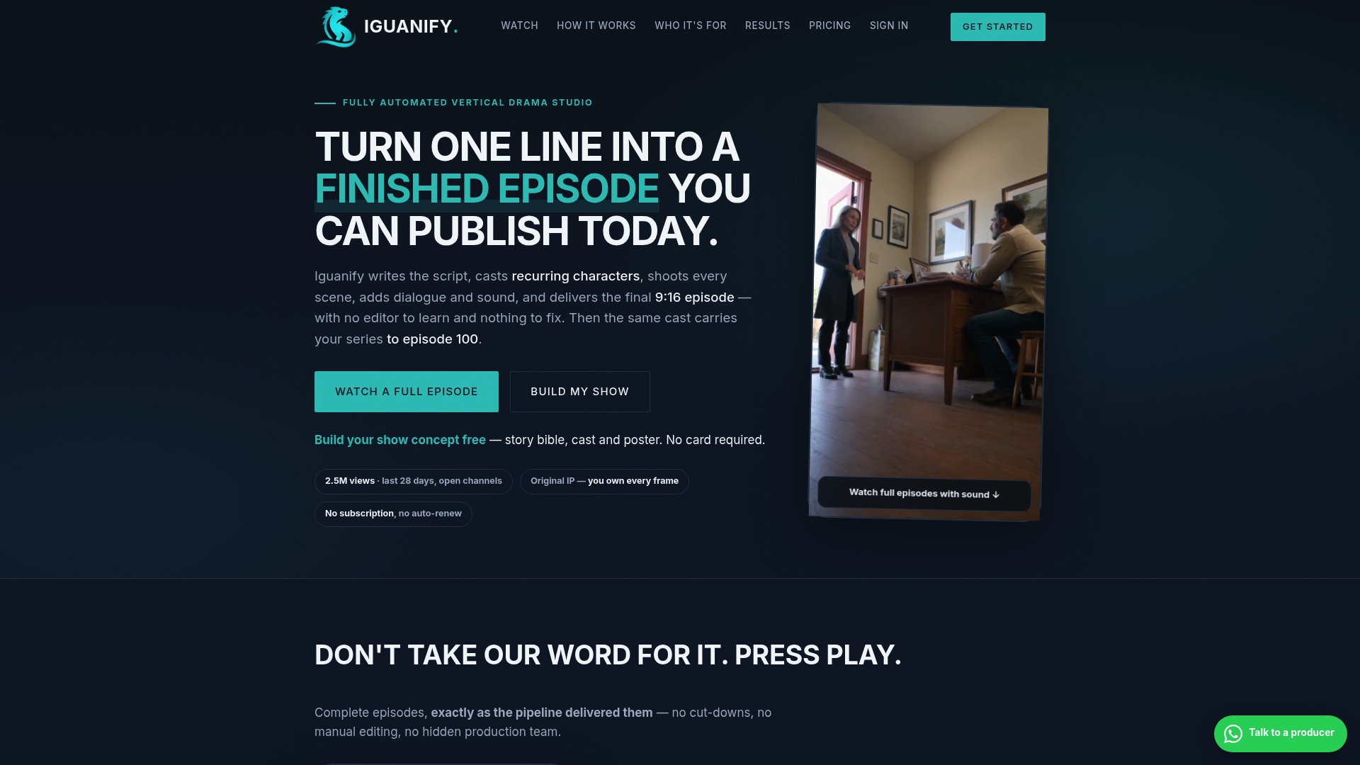
That means no separate design pass to match a character’s look across ten episode stills, and no guessing whether your poster art matches what viewers actually see in the show. Iguanify delivers episodes in real time, and you own full rights to everything it produces, poster kit included, ready to export and post directly to TikTok, YouTube, or Instagram. If you’re mapping out a season and want your key art produced with the same consistency as your cast, start with Iguanify’s episode production platform and generate a free show concept before you commit to a full season pack.
Sources
- Selecting the best artwork for videos through A/B testing — Netflix TechBlog
- BBC photography creative image guide
- Amazon artwork specifications — VideoCentral
- HBO Max original series key art — project case study