 IGUANIFY
Episodic Thumbnails and Covers: A Creator’s Guide
Yes: if your show is video-first, guest-driven, or leans on social clips, make episode-specific thumbnails and covers. Skip it only if you run a small audio-only show with no social promotion, where your energy is better spent on the show cover alone. YouTube recommends uploading thumbnails at 1280x720 pixels, Spotify suggests 1920x1080 for video thumbnails, and Apple Podcasts requires only a show-level cover to publish. Those three specs alone tell you most of what you need to decide where to spend your design time.
Here’s how to prioritize:
- Always make episodic art if you publish video episodes, host different guests each week, or clip episodes for TikTok, Instagram, or YouTube Shorts.
- Make it optional if you’re audio-only but occasionally run named guest episodes or seasonal arcs worth flagging visually.
- Skip it if you’re a solo-host audio show with a stable format and no real social distribution plan. Your show cover is doing enough work already.
Pro Tip: The highest return on episodic art shows up in three places: video-first episodes (where the thumbnail is the entire pitch), guest-driven interview shows (where a face drives recognition and shares), and any episode you plan to promote on social. If none of those apply to you this week, don’t force it.
Key Takeaways
Episode-specific thumbnails earn their place on video-first, guest-driven, or social-promoted shows, while a strong show cover alone carries small audio-only shows just fine.
| Point | Details |
|---|---|
| Match art to platform | YouTube needs 1280x720 thumbnails, Apple Podcasts needs a 3000x3000 show cover, Spotify video wants 1920x1080. |
| Prioritize by format | Make episode art for video and guest-driven shows; treat it as optional for audio-only shows with no social push. |
| Follow the face-and-contrast rule | vidIQ’s study found 89% of top-performing thumbnails used a face, high contrast, or both, with text capped near five words. |
| Build once, batch forever | A locked master template in Figma or Photoshop with CSV-driven exports keeps weekly production fast and consistent. |
| Test one variable at a time | Use YouTube Studio’s Test & Compare and track click-through rate alongside retention, not clicks alone. |
| Consider automated production | Platforms like Iguanify generate episode visuals and full episodes together from a single script line, removing the separate design step. |
Table of Contents
- Episode Thumbnails vs. Cover Design: What’s the Difference?
- Is Episodic Artwork Worth the Extra Design Time?
- What Design Choices Actually Improve Click-Through Rate?
- What File Sizes and Formats Do Platforms Require?
- How Do You Build a Repeatable Episode Art Workflow?
- Which Tools Should You Use for Episode Art?
- How Do You Test and Improve Thumbnail Performance?
- What Are the Most Common Thumbnail Mistakes?
- Can You Automate Episode Art Production at Scale?
- A Creator’s Practical Checklist for Episode Art
- Want to Skip the Design Queue Entirely?
- Frequently Asked Questions
- Sources
Episode Thumbnails vs. Cover Design: What’s the Difference?
Show cover art and episode thumbnails aren’t the same asset, and mixing them up is the single most common source of confusion for creators moving between platforms. A show cover is a square image, uploaded once, that represents your entire series. An episode thumbnail is usually horizontal, made fresh for each release, and it’s what a viewer sees before they decide to click.
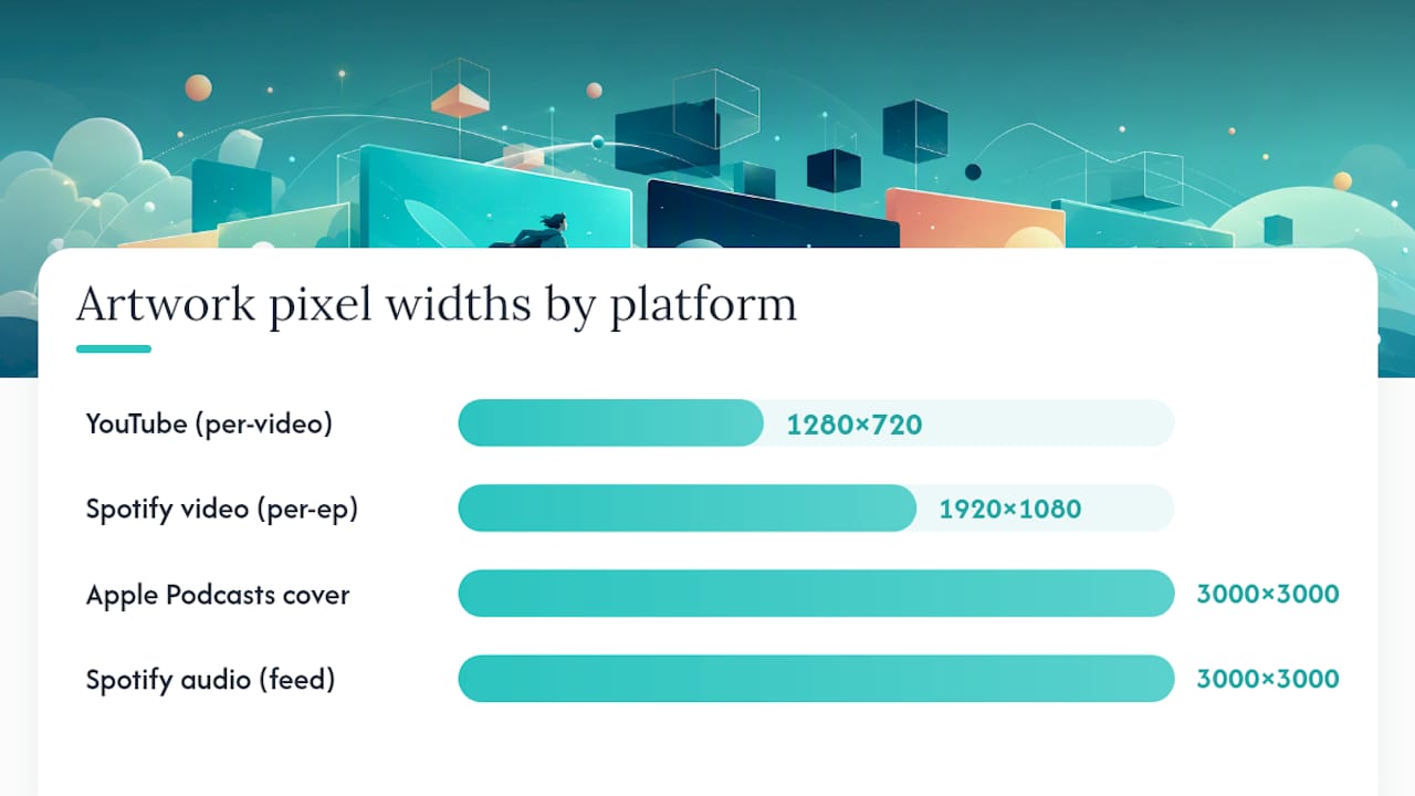
Apple Podcasts is the clearest example of this split. Apple requires a show cover to publish at all and treats episode artwork as strictly optional. YouTube runs the opposite way: the per-video thumbnail is the primary visual, and it dictates the 16:9 aspect ratio at 1280x720 pixels that most creators design around. Spotify sits in the middle. It uses horizontal thumbnails for video content at a suggested 1920x1080 resolution, while audio-only episodes fall back to whatever show or episode artwork is attached in the feed.
| Platform | Supported artwork type | Recommended aspect ratio | Recommended pixel size |
|---|---|---|---|
| YouTube | Per-video thumbnail | 16:9 | 1280x720 (min width 640px) |
| Spotify (video) | Per-episode thumbnail | 16:9 | 1920x1080 |
| Apple Podcasts | Show cover (required), episode art (optional) | 1:1 | 3000x3000 |
| Spotify (audio-only) | Show or episode art, feed-dependent | 1:1 | 3000x3000 |
Not every platform treats episode-level art the same way, and that gap is exactly where creators get burned:
- Full episode-level support: YouTube (every video gets its own thumbnail), Spotify video episodes (custom thumbnail per upload via Spotify for Creators).
- Optional, feed-dependent support: Apple Podcasts (episode art can display alongside the show cover, but many apps just fall back to the show cover), Spotify audio episodes.
- Show-level only, no episode override: Most legacy podcast apps and car dashboard integrations, which pull whichever image sits in the RSS feed’s primary artwork field regardless of what you upload elsewhere.
That third category matters more than most guides admit. If you’re not supplying both a square and a 16:9 variant in your RSS feed, some apps will crop your carefully composed thumbnail into an awkward square, cutting off faces and text. Advanced creators solve this by attaching both a square and a landscape image wherever the feed format allows it, since podcast hosts and feed consumers don’t always agree on which artwork field to read.
Is Episodic Artwork Worth the Extra Design Time?
Episode-specific art pays off in four concrete ways: it helps you get noticed in a crowded feed, it gives you something worth sharing on social, it lets returning viewers spot a favorite guest instantly, and it lets serialized shows visually signal “this episode matters” during a big arc. None of that is guaranteed to move downloads, though. Acast is upfront that episode-specific artwork is optional and that there’s no universal evidence it lifts download numbers for every show. Treat it as a discovery and branding tool, not a download hack.
Where it clearly earns its keep:
- Video episodes distributed on YouTube, where the thumbnail is functionally your ad.
- Interview or panel shows with a rotating cast, since a guest’s face on the thumbnail drives both curiosity and their own audience’s shares.
- Any episode you’re actively pushing on TikTok, Instagram, or X, where the still image is the first thing a scrolling audience judges.
- Season finales, crossover episodes, or narrative arcs in serialized shows, where a distinct look signals a shift without needing a caption.
Where it has limited impact: a small, audio-only show with a loyal but modest listener base and no active social promotion plan. If you’re not posting clips, not chasing new listeners through feeds, and not hosting guests who’ll share your art with their own following, the show cover alone is carrying most of your branding weight already. Spend your hour elsewhere.
What Design Choices Actually Improve Click-Through Rate?
Lead with one idea. A face, a single prop, or a bold graphic. Not three things competing for attention. That single rule solves more thumbnail problems than any color theory advice ever will, because a cluttered thumbnail reads as noise at the size most viewers actually see it: a two-inch square on a phone screen.
Here’s a repeatable template you can build once and reuse for every episode:
- Hero zone (60% of frame): a face or the episode’s single most identifiable subject, positioned off-center using a simple rule-of-thirds grid.
- Text block (top or bottom third): three to five words maximum, in a font weight bold enough to read at thumbnail size.
- Logo corner: your show’s mark, small and consistent, in the same corner every time.
- Background treatment: a flat color, gradient, or duotone overlay that matches your show’s palette so episodes feel like a set, not a scattered pile.
- Safe crop zone: keep faces and text inside the center 80% of the frame, since mobile feeds and TV apps crop edges unpredictably.
The design steps that matter most, in order: pick one subject, push contrast hard between subject and background, cap your text at three to five words, choose a heavyweight font, place your logo in a fixed spot, lock a small color palette across episodes, and always preview the crop at phone size before exporting.
That last point isn’t a style preference. In vidIQ’s analysis of 500 breakout YouTube videos, 69% used a human face, 56% used high-contrast color, and 89% used one or the other. Text overlaid on thumbnails was generally kept to a few words for readability. The pattern is consistent enough to build a checklist around: face or bold contrast, short text, one subject.
Pro Tip: Before you export anything, shrink your thumbnail preview to phone size on your own screen. If you can’t tell what the image is about in one glance, your viewer won’t either.
Pro Tip: Resist the urge to oversell with a shocked face or a misleading claim just to juice clicks. YouTube explicitly discourages misleading thumbnails, and creators who chase clickbait usually see retention collapse right after the click, which drags down recommendations over time.
What File Sizes and Formats Do Platforms Require?
Getting the export settings wrong is how a perfectly good design turns into a blurry, cropped mess on someone’s TV. Each platform has its own rules, and they’re not interchangeable.
Before you upload anything, run through a short export checklist: convert to sRGB color profile (wide-gamut exports can shift colors on non-Apple devices), use PNG when your design has sharp text or a logo with hard edges, use JPG for photo-heavy thumbnails to keep file size down, and leave at least a 10% margin around any text so nothing gets clipped in a platform’s auto-crop.
Naming conventions matter more once you’re producing weekly. A format like ep042_guestname_yt16x9.png tells you, at a glance, the episode number, the guest, and the platform variant, which saves real time when you’re uploading to three platforms in one sitting and your asset manager or a tool like vidIQ needs to grab the right file fast.
How Do You Build a Repeatable Episode Art Workflow?
Production speed comes from removing decisions, not from working faster. A tight five-step loop handles that:
- Brief: pull the episode’s core hook (guest name, topic, or twist) into one line before you open any design tool.
- Template setup: drop that hook into your master file, whether that’s Figma or Photoshop, so the layout, fonts, and logo placement never have to be rebuilt.
- Batch edit: swap the subject photo and headline text across every episode variant in one sitting, rather than starting fresh each time.
- Export: generate all platform variants (16:9, square, any social crops) from the same master file so they stay visually consistent.
- QA: check every export at phone size and on a TV-sized preview before uploading, since color shifts and bad crops hide easily on a desktop monitor.
Your master file should lock down five things so every episode looks like part of the same show: logo placement, font choices, a fixed color palette or duotone treatment, text style (weight, size, alignment), and the underlying grid. Change the photo and headline, keep everything else frozen.
A naming convention like ep042_guestname_platform_variant.png keeps files sortable at a glance, and if you’re using an asset manager, tag each file with the episode number, guest name, and publish date so nothing gets uploaded twice or overwritten by accident.
Which Tools Should You Use for Episode Art?
You don’t need a five-person design team to keep episode art consistent. Five tools cover almost every workflow a solo or small-team creator will run into:
- Canva: fastest way to build and reuse a thumbnail template, especially if you’re not comfortable in a full design app.
- Figma: better for creators who want systemized, swappable components across dozens of episodes, since you can lock a master frame and just swap text and images.
- Adobe Photoshop: the deepest control over photo editing, duotone effects, and batch actions if you’re processing raw photography.
- YouTube Studio: not a design tool, but essential for uploading, previewing, and A/B testing thumbnails once they’re made.
- Headliner: purpose-built for turning audio clips into video snippets with automatic captioning, useful when you’re repurposing a podcast episode into a social video with its own thumbnail frame.
If you’d rather start from a proven layout than build one from scratch, communities built around podcast and video design often share downloadable template packs with duotone treatments and grid layouts already worked out.
For creators publishing at real volume, a sheet-driven design setup (a spreadsheet feeding episode titles and guest names into templates) or an image API can turn a one-hour batch session into a ten-minute export run.
How Do You Test and Improve Thumbnail Performance?
Testing episode art isn’t guesswork if you run it as a loop: hypothesize what will improve clicks, create two or three variants, run them against each other, then read the results against real metrics.
- Hypothesize: pick one variable you think matters, like swapping a static graphic for a face.
- Create variants: build two or three versions that isolate that single change.
- Run the test: use YouTube’s Test & Compare feature in YouTube Studio, or manually rotate versions if you’re on a platform without built-in testing.
- Analyze: don’t just look at click-through rate. Check it against average view duration and retention curve shape.
Track click-through rate, average view duration, how sharply retention drops in the first 30 seconds, whether viewers come back for future episodes, and social share rate on any clip you post.
Pro Tip: Change one variable per test, not three. If you swap the face, the text, and the color all at once and clicks go up, you’ll have no idea which change actually worked, and you’ll have learned nothing for next time.
What Are the Most Common Thumbnail Mistakes?
Most thumbnail failures trace back to the same handful of habits, and each one has a quick fix:
- Too much text: cramming a full sentence onto the image. Fix: cap it at three to five words, matching what top performers in vidIQ’s data actually use.
- Low contrast: subject blends into background at small size. Fix: push a stronger color separation or add a duotone overlay behind the subject.
- Ignoring mobile crops: designing only on a desktop monitor. Fix: preview every export at phone size before upload.
- Inconsistent branding: logo placement or fonts shifting episode to episode. Fix: lock those elements in a master template file.
- Mismatched aspect ratio uploads: uploading a square image where a platform expects 16:9, or vice versa. Fix: export platform-specific variants from one master file instead of reusing a single image everywhere.
If a platform rejects an upload or renders it blurry, check file size limits first (YouTube caps thumbnails at 2MB), then check minimum pixel width. Cut-off faces almost always trace back to designing without a safe crop margin.
One more thing worth a quick check: if a guest’s photo or likeness appears in your episode art, confirm you have their permission to use it. A takedown request over an unauthorized guest photo is a far bigger headache than a redesign.
Can You Automate Episode Art Production at Scale?
Once you’re publishing multiple episodes a week, manual design starts to buckle. A few automation approaches scale without hiring a design team:
- Templating with CSV-driven exports: feed episode titles and guest names from a spreadsheet into a locked template for bulk output.
- Scriptable image APIs: generate on-brand thumbnails programmatically for creators publishing at high volume.
- Smart batch actions: Figma and Photoshop both support batch operations that swap photos and text across dozens of files in one run.
- End-to-end production automation: platforms built specifically for serialized content can generate consistent episode visuals and full episodes together, which removes the design step entirely rather than just speeding it up.
That last category is worth knowing about even if you’re not ready for it yet. It’s a meaningfully different approach from templating: instead of speeding up manual design, it removes the manual step.
Pro Tip: Whatever automation route you pick, keep a human QA pass in the loop. Automated batch exports can still produce bad crops or color shifts that a fast phone-preview check catches before anything goes live.
A Creator’s Practical Checklist for Episode Art
My own routine for episode art comes down to four checkpoints: capture a usable hero photo or frame before the episode wraps, drop it into the locked template rather than starting from scratch, preview the export at phone size before anything gets uploaded, and name each file variant clearly so nothing gets mixed up across platforms.
In practice, that looks like a weekly rhythm: batch-create every thumbnail for the week’s episodes in one sitting, schedule the uploads, then run a quick A/B test on the one episode you’re pushing hardest on social.
Tools have narrowed the gap between a two-person team and a full studio. Platforms built for serialized production, Iguanify included, now handle consistent visual output as part of generating the episode itself, which is worth knowing if your bottleneck isn’t design skill but hours in the day.
Want to Skip the Design Queue Entirely?
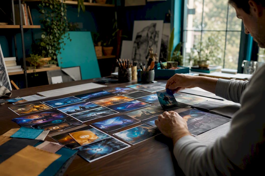
If you’ve read this far, you already know episode art takes real time to do well: a template to maintain, exports to check, crops to preview. Iguanify takes a different approach for creators who’d rather spend that time on the story than the file exports. Its AI drama generator produces full episodes, including consistent character visuals and poster art, straight from a single script line, with no separate design pass required and no production team to coordinate.
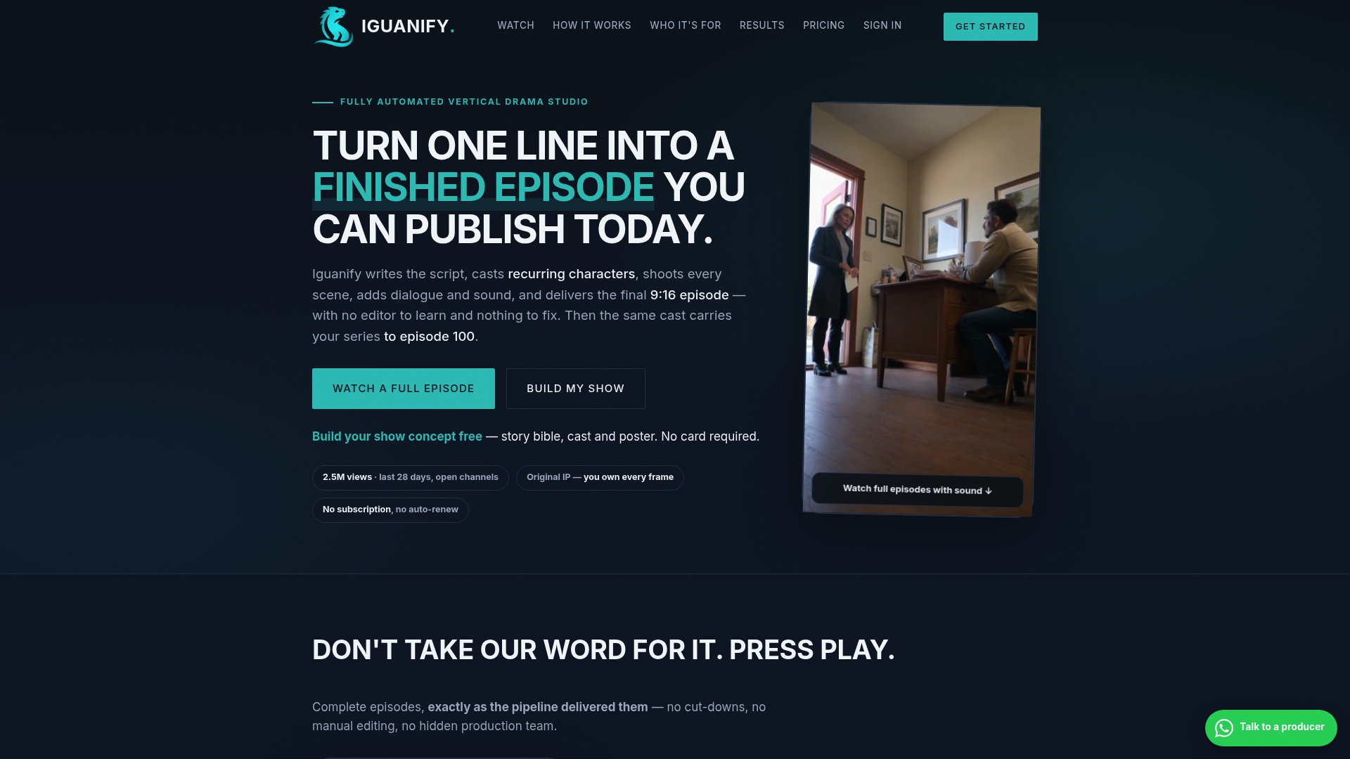
That matters most for creators building serialized, vertical-format shows for TikTok, YouTube, or Instagram, where a new episode (and its art) needs to go out on a tight, repeatable cadence. Since Iguanify keeps characters consistent across episodes automatically, the visual continuity problem that normally eats your Sunday afternoon just doesn’t come up. You keep full ownership of everything produced, ready to publish straight to your platforms of choice.
That said, if your show depends on a genuinely bespoke illustration style, a specific real-world guest’s photography, or hand-crafted art direction as part of its brand identity, a human designer working from the template approach in this guide is still the right call. Automation fits best when consistency and speed matter more than a fully custom look. If that’s you, check out Iguanify’s episode production tools and see what a script line can turn into.
Frequently Asked Questions
Do I need a separate thumbnail for every episode, or just a show cover? It depends on your platform mix. YouTube requires a unique thumbnail per video to function well in feeds, while Apple Podcasts only requires a show cover and treats episode art as optional.
What size should an episode thumbnail be? For YouTube, use 1280x720 pixels at a 16:9 ratio, staying above the 640-pixel minimum width. For podcast cover art on Apple or Spotify, use a 3000x3000 square.
Does episode art actually increase downloads or views? Not reliably. Acast is clear that there’s no universal lift in downloads from episode-specific art alone. It helps with discovery, social sharing, and guest recognition more than raw download counts.
How much text should I put on a thumbnail? Keep it to three to five words. In vidIQ’s sample of top-performing videos, the median overlay text length was five words, and shorter text reads better at small mobile sizes anyway.
Can I automate episode thumbnail creation? Yes. Options range from CSV-driven templates in Figma or Photoshop to full production platforms like Iguanify that generate consistent episode visuals as part of creating the episode itself, cutting out the separate design step entirely.
Sources
- YouTube Thumbnail Design Tips: Best Practices for 2026
- Thumbnail best practices - YouTube Creator Academy / YouTube Help
- Thumbnails - Spotify
- Artwork guide - Apple Podcasts for Podcasters
- What is episode-specific artwork? - Acast