 IGUANIFY
Poster Copywriting Cuts Three Ideas to One With Four Headline Formulas

A poster should carry one clear idea: a punchy headline plus one short next step. Everything else, the subhead, the visuals, the fine print, exists to support that single message, not compete with it. If you write one sentence before anything else, write the headline, make it legible from across a room, and pair it with one low-friction call to action.
TL;DR:
- Eye tracking research found that color and dynamic elements hold attention better than black and white or static designs, while contrast keeps copy legible.
- Keep headlines under ten words; research found puns rated more attractive and original, but only when readers understand them immediately.
- Use one supporting sentence only when it answers what, when, or where; unattended posters need an action readers can complete later, such as scanning a code.
- Scale type to viewing distance, use sans serif fonts for essential information, and reserve decorative scripts for atmosphere rather than instructions.
- Large posters can carry a headline and supporting line, but small flyers and social graphics should usually use only a headline and call to action.
Table of Contents
- What makes poster copy effective: attention limits and visual hierarchy
- Headline and slogan formulas you can use right now
- Writing supporting copy and calls to action that don’t clutter
- Typography, contrast, and layout rules for legible poster copy
- Examples and micro-rewrites: before → poster-ready after
- Quick checklist to run before you print or post
- Adapting copy for different poster sizes and placements
- Incorporating brand voice and identity in poster copy
- Legal considerations and copyright basics for poster content
- Strategies for targeting specific audiences with poster copy
- Integrating visual elements with copy for maximum impact
- Testing and refining poster copy based on audience feedback
- Author perspective: how poster copy fits serial/episodic branding
- A faster way to get series-ready poster art and copy
- FAQ
- Sources
What makes poster copy effective: attention limits and visual hierarchy
People passing a poster make a snap judgment before they consciously decide to read it. You have a window measured in seconds, not minutes, to earn a second look. That’s why visual hierarchy matters more on a poster than almost any other format: the eye needs a clear path from the most important element to the least.
An eye-tracking study of commercial poster design found that color posters generally sustain visual attention more effectively than black-and-white versions, and that dynamic elements significantly outperform static ones in capturing attention. That doesn’t mean every poster needs motion or saturated color. It means the elements you do use should work together, not scatter the viewer’s focus.
- Lead with one idea: a poster trying to say three things usually communicates none of them clearly.
- Let headline and contrast carry the weight: these are what eyes fixate on first.
- Use imagery to support the message, not replace it: a strong photo still needs a strong line of copy next to it.
A poster with high visual contrast between text and background tends to hold attention longer than one that relies on busy backgrounds or low-contrast color pairings, according to the same eye-tracking research on attention capture.
Headline and slogan formulas you can use right now
A poster headline has one job: stop the scroll, or in this case, stop the footstep. You don’t need to be clever to do that. You need to be clear, fast, and specific. A few formulas cover most situations:
- Benefit: tell the reader what they get. “Faster Checkout Starts Here.”
- Command: tell them what to do. “Grab Your Seat Before Friday.”
- Curiosity or pun: create a quick, resolvable gap. “Thyme’s Running Out” for a spice sale.
- Offer plus urgency: pair a deal with a deadline. “20% Off, This Weekend Only.”
Aim for a short headline. Shorter headlines read faster, and reading speed is the whole game on a poster. If you can’t trim it below ten words, you probably have two ideas fighting for one line.
Puns deserve a specific note. Research on pun processing in advertising posters found that posters using wordplay are rated as more attractive, original, and effective than unambiguous ones, even though puns take slightly more effort to process. The tradeoff works in your favor only when the audience can resolve the joke in a glance. A pun that needs explaining has already lost the room.
Pro Tip: Read your headline out loud once. If you stumble or need to pause mid-sentence, a passerby will too.
Writing supporting copy and calls to action that don’t clutter
Once the headline lands, you get one more sentence, maybe, before attention drops off. Use it to answer the single question your headline raised: what, when, or where. If the headline already answers that, skip the supporting line entirely. A poster with no subhead is often stronger than one with a weak one.
The call to action needs the same discipline. Pick a verb that requires almost no thought: Visit, Scan, Join, See, Call. Pair it with one direction, not a list of options.
- “Scan to RSVP” beats “Scan the QR code below to learn more and register for the event.”
- “Visit Us Saturday” beats “Stop by our location this coming weekend to check out the new collection.”
- A staffed poster, like one at a booth or storefront, can use an immediate CTA such as “Ask Us How.”
- An unattended poster, like a bus shelter ad, needs a CTA the reader can act on later, such as “Scan for Details” or a short, memorable URL.
Typography, contrast, and layout rules for legible poster copy
Hierarchy on a poster isn’t a design preference, it’s a reading instruction. The headline should be large enough to read from the poster’s intended viewing distance, the supporting line meaningfully smaller, and the CTA smaller still but still easy to spot. If someone has to walk up close to read your headline, it’s too small.
Practical poster design guidance from Whitman College recommends scaling fonts to the expected viewing distance, using sans-serif fonts for quick legibility, and avoiding decorative scripts for anything the reader needs to actually process. Save stylized fonts for atmosphere, not information.
- Keep a clear size gap between headline, supporting line, and CTA so the eye knows where to start.
- Choose sans-serif type for anything functional; reserve scripts or display fonts for decoration only.
- Maximize contrast between text and background, and use an accent color sparingly to flag the one word that matters most.
- Leave generous white space and place key information near the top-left or top-center, where the gaze naturally lands first.
A related study on typographic persuasion in advertising found that weight and contrast choices should match how much effort the audience is realistically willing to spend processing the message, which on a poster is very little.
Pro Tip: Step back ten feet from your screen or print and squint. If the hierarchy isn’t obvious, fix it before you finalize the file.
Examples and micro-rewrites: before → poster-ready after
Seeing a clunky line turn into a sharp one is the fastest way to internalize these rules. Here are five rewrites, each with the reasoning behind the cut.
- “Join us for our annual community bake sale happening this Saturday at the park” becomes “Bake Sale, Saturday, the Park.” Cuts filler, keeps the three facts that matter.
- “We have the freshest seafood in town, come see for yourself” becomes “Caught Today. Sold Today.” A benefit-driven line that implies freshness without stating it directly.
- “Our new bakery specializes in artisanal bread made daily” becomes “Loaf Me Alone, I’m Fresh.” A pun that’s resolvable in under a second, built for a storefront window.
- “Learn more about our services by visiting our website” becomes “Scan to See What We Do.” Replaces a vague CTA with a specific action.
- “Don’t miss this incredible limited time offer on all winter coats” becomes “Winter Coats, 30% Off This Week.” Leads with the offer and the deadline, drops the hype words entirely.
Quick checklist to run before you print or post
Before anything goes to print or gets posted online, run it through this short pass:
- Does the poster communicate one idea in under three seconds?
- Is the headline readable at the distance people will actually stand from it?
- Is the call to action a single, low-friction verb with one direction?
- Have you proofread the copy and tested it zoomed out or in a printed mockup?
If any answer is no, fix that issue before touching anything else.
Adapting copy for different poster sizes and placements
The same headline that works on a full-size event poster will fail on a phone screen or a small flyer taped to a corkboard. Size and placement should dictate word count and font scale, not the other way around.
For large-format posters, like event signage or storefront windows, you can afford a headline plus a short supporting line because the viewer has a longer glance. For small-format pieces, like flyers, table tents, or social graphics sized for a feed, cut to the headline and CTA only. There usually isn’t room for a third element, and adding one just competes for attention.

Vertical formats, increasingly common for social and mobile-first placements, need copy stacked to match the natural scroll and glance pattern: headline near the top third, CTA near the bottom where a thumb naturally rests. If you’re producing poster art sized for vertical feeds or episodic series promotion, our guide to vertical poster sizing and safe zones covers the specific dimensions and margins that keep text from getting cropped on different platforms.
Placement also changes urgency. A poster near a cash register or entryway, where someone pauses briefly, can use a slightly longer CTA. A poster glimpsed from a moving car or a fast-scrolling feed needs the shortest possible headline because attention is limited.
Incorporating brand voice and identity in poster copy
A poster is often someone’s first encounter with your brand, which means tone matters as much as content. A playful pun fits a bakery or a comedy series. A terse command fits a fitness brand or a product launch. Matching voice to the poster’s format also matters: casual slogans suit community flyers, while a direct offer suits retail signage.
Consistency across multiple posters builds recognition faster than any single strong headline. If you’re producing posters for a series, a seasonal campaign, or a recurring event, keep the same tone, color palette, and headline rhythm each time. A reader who’s seen one poster from you should recognize the next one before reading a word. For creators building out a series or episodic brand, our walkthrough on series poster design covers how to keep that visual and tonal consistency across multiple releases without starting from scratch each time.
Voice doesn’t mean decoration. A brand’s personality should show up in word choice and rhythm, not in extra words. “Grab Your Seat” and “Please Consider Attending Our Event” might come from the same brand, but only one of them sounds like someone a reader wants to listen to.
Legal considerations and copyright basics for poster content
Before you print or publish, check that every element on your poster is something you have the right to use. Stock photos, fonts, and illustrations usually come with licenses that specify where and how they can be used, commercial use often requires a different license than personal use, so check the terms attached to anything you didn’t create yourself.
If your poster includes a trademarked name, logo, or someone else’s slogan, you generally need permission to use it, even in a parody or tribute context. The same applies to photos of identifiable people: many jurisdictions require consent for commercial use of someone’s likeness. When in doubt, use original photography, licensed stock with clear commercial terms, or original illustration.
Copyright on your own poster copy and design belongs to you the moment you create it in most cases, but ownership can get murky if you hire outside help without a clear agreement. If a freelancer or outside production service creates poster art for you, confirm in writing that you retain full rights to use, reproduce, and modify the final piece. This matters most for recurring content, like a series or campaign, where you’ll want to adapt, resize, or reuse the artwork repeatedly without renegotiating rights each time.
Strategies for targeting specific audiences with poster copy
The sharpest poster copy speaks to one audience’s specific situation, not a general crowd. A poster for college students promoting a campus event can use slang and urgency that would feel off-key on a poster aimed at retirees. Start by identifying where your audience will actually encounter the poster and what they’re likely doing in that moment, rushing to class, waiting for a bus, scrolling a feed between videos.
Age, context, and intent all shape word choice. A younger audience tends to respond to casual, direct phrasing and visual humor, including puns, since the research on pun processing found wordplay boosts perceived originality and effectiveness when the audience can resolve it quickly. A professional or older audience often responds better to a clear benefit statement without wordplay, since the goal is speed of understanding, not novelty.
Local or niche audiences respond to specificity: naming a neighborhood, a shared reference, or a recognizable detail does more work than a generic claim. A poster that says “Fresh Bread, Daily” works anywhere, but “Fresh Bread, Baked Before Your 8 AM Train” works specifically for commuters who pass that bakery every morning. The narrower the audience, the more specific the copy can afford to be, and the more it will stand out from generic competitors nearby.
Integrating visual elements with copy for maximum impact
Copy and image need to work as one unit, not two separate layers stacked on top of each other. A strong photo paired with a weak headline wastes the photo’s pull. A strong headline on a cluttered background loses its legibility before anyone finishes reading it.
Outdoor advertising research analyzing nearly 200 posters found that large amounts of text and busy imagery, including photos of people, actually delayed recognition, while clear branding and short headlines paired with simple product shots improved both recognition speed and creative appeal. The lesson carries over directly to any poster format: the image should point toward the headline, not away from it.
Placement matters as much as content. Put your headline where it doesn’t overlap a busy part of the image, and use negative space in the photo itself as a natural frame for the text. If you’re working with a design partner, a primer on typographic choices in visual design is a useful reference for matching font weight and contrast to a background image without one fighting the other.
Color can reinforce the message too. An accent color pulled from the image and echoed in the headline or CTA creates a visual link between the two without needing extra words to explain it. The goal is a poster where a viewer processes image and text as a single thought, not two competing messages.

Testing and refining poster copy based on audience feedback
The checklist earlier catches obvious problems, but real feedback catches the ones you can’t see because you’ve stared at the poster too long. Before a big print run or a wide social push, show the poster to a few people who haven’t seen it, and time how long it takes them to tell you what it says and what to do next. If they hesitate or get it wrong, the copy needs another pass, not the design.
For posters going out digitally, you can test more directly: run two headline variants on the same image for a short period and compare which gets more clicks, saves, or scans. Small wording changes, swapping a command for a benefit line, or shortening a CTA from four words to two, often move engagement more than a full redesign would.
Printed posters are harder to test live, so lean on a mockup review instead: print a reduced-scale version, pin it up, and walk past it from different distances and angles. Ask a colleague unfamiliar with the project to glance at it briefly and report back what stuck. That single piece of feedback often reveals more than a week of internal revisions, because it mimics exactly how a stranger will actually encounter the poster in the wild.
Author perspective: how poster copy fits serial/episodic branding
A poster for one episode should feel like it belongs to the same family as the others, with the same headline rhythm, tone, and visual anchor. That consistency is what makes a recurring audience recognize your next drop before reading a word. When I produce poster copy for a series, I run a quick check: does this headline sound like it came from the same voice as the last one, and would a new viewer still get the hook in three seconds? If either answer is shaky, I rewrite before moving on.
— Leonard
A faster way to get series-ready poster art and copy
Writing sharp poster copy is one skill. Producing matching poster art for every episode of a series, fast enough to keep up with a weekly or daily posting cadence, is a different problem entirely. That’s where we built Iguanify to help: our platform supports full episodic production, so poster art and copy can look and sound like they belong alongside the others.
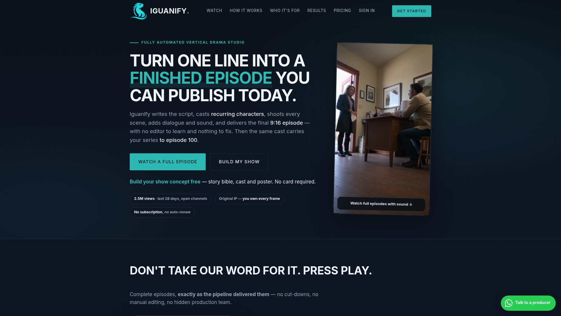
- Create poster art that fits your series’ recurring characters and tone, rather than a one-off graphic that doesn’t match.
- Bring poster assets into your episode production workflow.
- Keep full rights to the content produced, so you can resize, repost, and reuse it across platforms without asking permission.
If you’re building a series and want poster assets that match your show without a separate design pass, check out our AI drama generator to see how episode and poster production work together.
FAQ
Can copywriting provide a substantial monthly income?
Income from copywriting, including poster and advertising copy, depends heavily on client volume, niche, and experience, and no fixed figure applies to every freelancer. Some copywriters reach that level by combining retainer clients with project work, while others focus on a narrower specialty like poster and signage copy as one part of a broader service offering.
What is the Pareto principle in copywriting?
The Pareto principle is sometimes applied to copywriting to suggest that a small part of the work, such as the headline and core message, may drive much of the response. On a poster, give the headline careful attention. On a poster specifically, this means the headline deserves far more revision passes than the supporting line or fine print.
Is selling posters profitable?
Selling physical posters as a product is a separate business from writing poster copy for advertising, and profitability there depends on print costs, design quality, and distribution channels rather than copywriting skill alone. For poster copywriting as a service, profitability tends to track with how specialized and fast you can deliver results for recurring clients like event organizers or retailers.
Is copywriting still worth it in 2026?
Copywriting remains a practical skill because every poster, ad, and campaign still needs a human decision about what single idea to lead with and how to phrase it. Tools can speed up drafting, but the judgment calls around hierarchy, audience, and tone, the kind covered throughout this guide, still shape whether a poster actually gets read.
Sources
- An Eye-Tracking Study of Attention Capture Efficiency in Commercial Poster Design
- Pun processing in advertising posters: evidence from eye tracking
- Whitman
- Split-Second Recognition: What Makes Outdoor Advertising Work?